Showing posts with label Stamps and Stencils Challenge. Show all posts

Friday, February 17, 2017

I see ...love?... in your future

I have always wondered what fortune tellers can see in your palm: a bright future, children, a trip over the ocean... those are the classics. And then there are the love lines.
This being the Valentine's month (not the day anymore but a full month!) I wanted to explore the love lines a bit more.
 "I see a man in your future" - also a classic line.
But what could a palm reader say that we wouldn't expect? Here's my take on the subject:


"Don't play with love" , yet "Allow yourself a little flirt."


Background was made with Gelatos, inks, acrylics and includes stamping and stenciling.
The hearts are made with cardboard. First I stamped them, then dyed in with Distress ink 'Aged Mahogany', my new favorite, and lastly topped off with a dome of crackle. (This was a try-out, I wanted to see if it would work with inks, but apparently not. )
I still have more and they will make an appearance some day.


Red is a very difficult color to handle - at least for me it is - so I am extremely happy with Aged Mahogany as reds go, it is deep and mysterious and removes the sweet sting from a basic red.

entering in:
Dream in Darkness: February challenge
Emerald Creek Dares: Rock the Red
Stamps and Stencils: Texture, crackle and paint


Wednesday, August 31, 2016

Fly home 2.

Another bird, same quote as on the tag a few days ago - this time the mood is a bit darker. The evening is closing on, home is still far away.


This journal page was made with stenciling, stamping, resist stamping, watercolor and Infusions.
I just love the way Infusions particles react when you sprinkle them over a wet surface.


The bird was stamped with embossing ink, then embossed with clear powder. (A few flakes of gold made it into it, I had just been playing around with sheet gold.)

  
The Big Dipper (made of silvery diamante dots) is guiding the bird as it flies home.
There is a key lying in the grass.  (With some more diamante dots, a second, this time colorless and raised stenciling above the first which I then highlighted with a rubbing of golden mica.)


 I am entering my journal page into:
Fashionable Challenge: #114 Resist stamping
Stamps and Stencils: Take flight
Stamploration: Stencil Sunday August challenge


Tuesday, July 26, 2016

Christmas in July

These deer would like to wish you am merry festive season. Walking in grass, but with snowflakes... that's Christmas in July for you.


I started with a tissue paper on cardstock. I sprayed blue mica spray through a stencil of tree branches. The circle was done with white embossing powder. I used three different stamps, they are by PaperArtsy, RubberDance and Inkadinkadoo.


Background was treated with mint green acrylics, the snowflakes stamped with blue, grass with green. (That is the only deviation from the color inspiration, I just could not see deer walking on sand.)


The deer are picture transfer (my new love). I painted them with acrylic.


entering this into:
Country View Challenges: Fun with Circles
Stamps and Stencils: Tic Tac Toe (tissue-circle-embossing)
RubberDance Art: Christmas in July
color inspiration:

Wednesday, May 11, 2016

Quite the opposite / tägi Timpan ohjeilla

I have been forever reading Tim Holtz Tags Challenge and oohing and aahing over the tags that are created. This year is a remix that takes two previous techniques and combines them. It's May, almost half of the year has gone and finally I pick up my courage to try!
This of course coincides beautifully with the challenge over at Frilly&Funkie, who think it is time to shake up your routine and make something you never usually do.
And pink! I love pink, and this is just the way to use it.

It is a clever mix of techniques, stamping over TH tissue tape which acts as a resist. (It would normally leave the face manila color, but I was so enamored with pink I coated my tag with it before starting.)
I also colored in the ribbon, then crunched it and let it dry. (This produced crinkles and an uneven color.)

The background was stenciled (I love the flower stencil!), then colored in with inks (crushed olive, broken china, rusty hinge). Last were the flowers, I had great fun making them, though without the die they became rather open and large. But the openness was a plus, because I could add some seed pearls into their centers. They were colored using glittery peachy pink mist, the leaves with olive crush ink.
Why don't you go and hop over to learn some nifty new techniques!
entering this into:
Tim Holtz Tags 2016: May
Frilly and Funkie: Opposites attract
Stamps and Stencils: Think pink

Tägi syntyi Timpan ohjeilla. Nyt kun minulle on vihdoinkin alkanut kertyä aa/ hieman enemmän mömmö- ja tekniikkaymmärrystä  ja bee/ Timpan tarvikkeita, ajattelin vihdoinkin osallistua hänen haasteisiinsa. Tägejähän en yleensä tee, ne ovat jotenkin niin turhia, mutta on kyllä kiva kokeilla uusia tekniikoita. Tässä on jujuna Timpan paperiteipin käyttö. Kun sen päälle leimaa niin se leimaus pysyy muuttumattomana vaikka kuinka ruiskisi korttiin muita värejä. Minun naisenpääni on pinkki siksi, että maalasin kortin pinkiksi ennen kuin tein mitään muuta.
Mutta just kun sanoin että tägit on niin hyödyttömiä, niin onhan nää kivoja. Voi lähettää jollekulle tyyliin 'kiitoksia vaihdosta' kun tietää saajan osaavan arvostaa kaikkia niitä työvaiheita.

Tuesday, April 19, 2016

Boy oh Boy

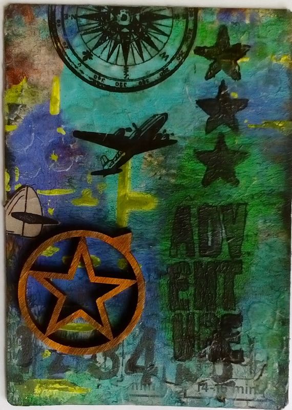
Iam still experimenting with mixed media. Here I piled a lot on one card... let's see: the substrate is a store bought frozen pizza box which was printed in black and silver.
I sanded most of the shiny stuff off, then brayered with three colors, turq, green and blue (acrylics). I stenciled on some yellow, but didn't like it much (too much contrast for me). So I waited till everything was dry, then went on to add some colorless gesso through a (dotty) stencil. Once that was dry I went over everything with olive drab ink. I thought I could hide the yellow, but no, it refused to be covered.

 Funny that the ink took only to the colorless gesso and left acrylics untouched.
I thought I might as well do a grungy look, so I did a lot of stamping in black, stars, numbers and texts.
Then came some images, a few rub-ons and brads.
I had some wooden embellishments that I thought would work. And voila! (Btw, under the word Adventure you can still catch a glimpse of the baking instructions for that deep frozen pizza, 12-15 minutes... I f you don't know what it was originall it just adds a nice touch.)

entering this into:
Frilly and Funkie: Boy oh Boy
Stamps and Stencils: Trash to treasure

Friday, March 4, 2016

Spring is in the Air

It's lovely to get to see the sun more and more. Some days start with rain and freezing cold, then magically turn and pamper us with mild, fragrant, sun-filled air.

Today is one of those days. I am progressing on my self laid road of getting to know mixed media, and more importantly, getting to know the stuff I own. Last weekend I visited a scrap show and got loads of new supplies. Today I was in the mood for trying out Gelatos, a completely new concept for me. I was a bit timid, there is not really so much color this time.

(clicks for bigger)

So this is what's going on here: white chalks through a stencil onto kraft background. Then highlight and added color with Gelatos, smudged and smeared with my fingers. (The accompanying brush was good for nothing. It sucked up the color instead of smearing it and bristles broke off right a way. Does someone have a good tip for this?)


After that I arranged the butterflies and chipboard flowers (Wyzinanka - lovely stuff!) on a piece of sewing pattern tissue which I had stamped with a flourish pattern. Finally came pieces of paper tape printed with vintage images and finally word stickers by the lovely 7 Dots Studio.  (I am linking these, because I usually am curious about other people's supplies and where they got them, and I'm thinking you'd like that info, too.)


I'm entering these into:
Berry71bleu challenge for March (inspiration mood board)
Stamps and Stencils: Spring
Frilly and Funkie: Layer it up


Sunday, July 5, 2015

A red, white and blue summer

Red, white and navy are fresh summer colors. Add polka dots to the mix, stir in a bit of summer feel and vacation mood and you've got yourself some fresh looking cards.


Simon Says Wednesday challenge wants to see polka dots. No, actually they say "going dotty", a word that I took firstly for dots and secondly for being dotty, that made me add some delightful nonsense:

"Hi! Are you looking for something?"

"How weird. I seem to have my shoes on."

I was influenced by a few other challenges as well:

Wicked Wednesday ATC Challenge asks for red, blue and white. I think my atc's are not very wicked, but I'll enter them anyway, just because there are so few ATC challenges around.
PaperArtsy #12 calls for stencils. They have a lot of inspirational technique videos for us. I was very inspired by stencil bumping.
 Simon says Monday wants to see how we interpret summerStamps & Stencils calls for vacation mood.

Background was first stenciled with red acrylics, then with navy chalk. The retro ladies are from a 1950's sewing pattern sheet for beach shorts, found text from a novel, and flowers were stamped onto a paper napkin and colored.
Thanks for looking!

Thursday, June 11, 2015

Gentleman Callers

A lot of the challenges this month (week, too!) give masculine prompts. What's considered masculine? Pipes and cars, cigars and airplanes, fishing, tobacco brown and navy for color, hunting, hiking, paragliding... what else is there? Oh yes, grilling, pitching a tent, washing a car, reading a newspaper. (I am bored already.)

I started thinking of secret and urgent desires of gentlemen, perhaps of an era gone by. A"gentleman caller" chez a lady was never appropriate and would tarnish her reputation. However, there were always ladies not too picky on reputation and more concerned about their bread and butter (and a new silk gown...) if you get my drift.

The atc's are about men, but they don't show men.
Gentleman callers in the Night 1-3
Rosie lives in 940 B--- Street

She also plays at a revue theater
Ellie in apartment 2 will stay up late
Entering these into:
Smudgy Antics Challenge: Anything goes (but with a twist into macabre, dark, creepy or saucy... this is saucy)
Anything but Cute Challenge: Masculine
Stamps and Stencils: Small is beautiful (meaning atc's, tags... the likes)

On technique:
I made the background paper. It is a babywipe, dried up long ago but kept for just this purpose.  It had blue ink from cleaning some stamps. I placed wooden numbers on it to get a stencil and sprayed everything with blue and brown Tattered Angels mist. While it was drying I took all my vintage office stamps and stamped all around. When it was dry I cut it into three pieces for backgrounds, added Victorian photos of ladies, the spray painted numbers and some found objects.

Tuesday, May 12, 2015

Sad stories 1-3

Don't get me wrong - I love the light and happy and romantic pieces as much as the next man, ahem, woman. But sometimes there is a need for some darkness. I found the challenge Smudgy Antics, and just knew this was a place to try and explore some of the less-happy, less-light pieces that sometimes must be made.
I am also participating in Stamps and Stencils May challenge with this. There we are asked to make "three of a kind". Backgrounds are stamped with a swirl.

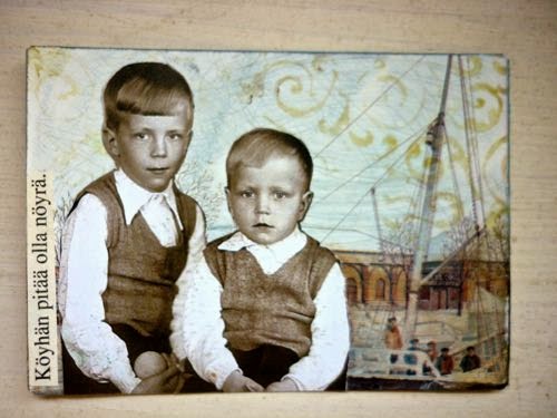
I have had these children on my desk for a while. They are pensive, they don't show much emotion, I feel they cannot be living amongst butterflies and kittens and roses.

Instead, meet them in Sad Stories.

click for larger
I was left alone in the world:


Poor must be meek:


Antti became an orphan early in life:


All set against the backdrop of Turku, a sea-faring town, one could imagine Antti setting out to sea to make a living, the poor sibling boys living with a tyrannic aunt or shuffled from house to house until they are old enough to start working. And the girl, on the verge of adolescence, no doubt has to find herself a household to work for. Probably normal fates back then, a hundred, 120 years ago, but unthinkable for us.


Surullisia tarinoita kolmen kortin sarjana. Antti joutui varhain orvoksi, veljekset (Köyhän pitää olla nöyrä) ja nuori tyttö, lapsi vielä (Olin yksin). Joskus on hyvä käsitellä aiheita, joissa ei kuki ruusut, eivät kehrää pehmoiset kissanpennut eikä aurinko aina paista. Taustat ovat Turusta, niin valokuvatkin.
Kommenttisi ilahduttaa! Mitä ajattelet vakavista atc-korteista? Vai miellätkö atc't enemmän herttaisiksi ja romanttisiksi vintage-korteiksi?